The Create Process Definition UI provides a canvas for drawing and visualizing the automation. Drag-and-drop components onto the canvas and connect them to create an automation workflow. As you populate the canvas with each event, task, gateway, and connector element, use the Properties view to configure and customize the element.

Enter a process name in the required Name field.
Optionally, enter a process description in the Description field.
Select a process definition Category.
Select or deselect the Enable Process Definition toggle.
Use the counterclockwise arrow to sequentially Undo canvas operations, stepping back through previous process definition steps. Click the clockwise arrow to Redo each of the steps that you previously undid.
Click Clear to erase all of the components currently visible on the canvas, effectively erasing the currently visible process definition, permitting you to start a new process definition.
Close and save buttons
The page footer has buttons to save the process definition or discard changes since the last save.
Click Save to keep the current process definition without deploying the definition. If required component definitions and properties are not provided, the dialog prompts you to enter the missing information before saving the process.
Click Save & Deploy to keep the current process definition and deploy the process definition. If required component definitions and properties are not provided, the dialog prompts you to enter the missing information before saving the process.
Click Close to discard changes since you last saved the definition. If there are unsaved changes on the canvas, a prompt requests confirmation that you want to exit: There are some unsaved changes. Do you want to close? Click Yes to exit the dialog and discard the changes. Click No to continue the process definition.
Component menu
Drag the component from the component menu onto the canvas. To position a component on the canvas, click the component then click the location on the canvas where you want to place the component. After the component is on the canvas, you can move it by dragging it with the mouse.
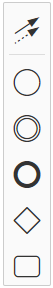
The components, from top to bottom, are:
- The global connect tool connects the other components. You can name the connection and change the appearance of the connector.
- Use the start event, StartEvent, to define the events and conditions that trigger the automation.
- Use the create intermediate/boundary event, Create Intermediate/Boundary Event, to define intermediate start, stop, or timer events.
- Use the end event, EndEvent, to indicate automation process completion.
- The gateway permits you to define conditional branching in your workflow.
- A task is the main unit of work. Tasks receive events, take an action on the event, and produce output events for downstream tasks in the workflow. There are four task types, depending on the activity the task performs. Each task type has configuration properties that permit you to reference the task and define task behavior.
See the reference section for detailed component descriptions.
Component tools
With the component on the canvas, click the component to display or hide the toolset associated with the component. Use these tools specify the type of currently selected component, to connect to other components, and to delete the component:
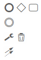
The available tools depend on the component type. Click the component to toggle the toolset display between visible and hidden.
The tools across the top help define the next process step and automatically connect the current and downstream components. End event, gateway, or task can be appended to the process workflow.
Click the wrench icon to specify the currently-selected component type. For a task component, for example, you can select from four types of tasks. Selecting the component type changes the component visualization to the icon associated with the new component type. After selecting the component type, click the component to display the Properties view associated with the component, which permits you to customize the component and define how data is processed. For tasks, if a task type is not defined, you are prompted to define a task type: Please Define Task type. Other component rendering displays a default type.
Click the delete icon to remove the currently selected component.
Click the arrows icon to create a component connector. Click each of the target components in sequence to connect the components in the workflow.
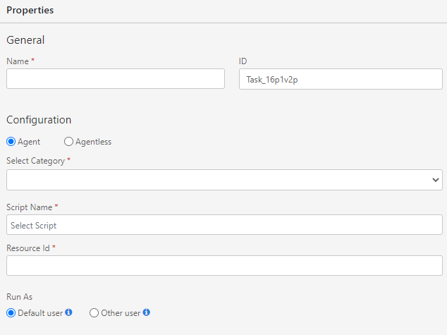
Component properties view
Click the Properties arrow to expand or hide properties view, where you can specify component characteristics and data handling:
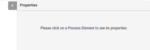
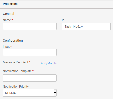
If no process component is currently selected, the dialog prompts you to select a component to display the component properties. The properties view displays the properties applicable to the currently selected component. For example, compare the different properties of a send-type task and a script-type task.
Send task type:
Script task type:
The properties view presents menus, edit fields, and radio buttons to enter property values.
For edit fields, you can enter a value manually or use the auto-completion feature. To use the auto-completion feature, enter the $ character. This displays a list of valid property values. Some list values you previously defined when you defined the properties of other components on the canvas.