A Tile is used to configure and visualize different metrics using the basic or advanced PromQL or OpsQL query builder. A collection of tiles is called a Dashboard.
The following steps let you create a Tile visualization from a query:
- Create a dashboard.
- Select from the following tiles:
- Metric
- Text & Image
- Resource
- Alert
- Build a PromQL or OpsQL query using the basic or advanced query building to populate your visualization.
- Select from the available chart types:
- Line/Bar - displays multiple time series as a graph or bar graphic.
- Single Value - displays a single value.
- List - displays values in a list format.
- Gauge - displays multiple time series using a gauge graphic.
- Honeycomb - displays multiple time series in a hexbin or hexagonal graphic.
- Pie - displays data in a circular graph.
- Customize the visualization.
- View the dashboard on the main dashboard page.
Tiles
The following are the available Tiles in Dashboard:
| Tile | Description |
|---|---|
| Metric | Aggregate monitor value is shown for the given metric. Search for the metrics using the PromQL query. View the results in the following formats:
Click the Legend to redirect the visualization to the Resources details page. Click the Legend for Line/Bar and List visualizations. Click the image for Gauge and Honeycomb visualizations. This option is not available for Single Value visualizations. |
| Text & Image | A Text tile is used to create a text. Click the Data tab to create the text. An Image Tile is used to upload Images. Click the Visualization tab to upload images. |
| Resource | Provides information about the breakdown of resources. A list of resources available in the Infrastructure is displayed under the Type header. Search for the resources using the OpsQL query to view the resources specific to the search criterion. By default, the resources are categorized by the Type attribute. You can select up to a maximum of two attributes in the Group By field.
|
| Alert | Provides information about the breakdown of alerts.
Search for the alerts using the OpsQL query.
View the results in the following formats:
|
Create a Metric Tile
- From Dashboard, create a new dashboard or select from an existing dashboard collection.
- Click CREATE TILE or + from the toolbar.
- In the ADD TILE screen that appears, select METRIC.
The following screen is displayed: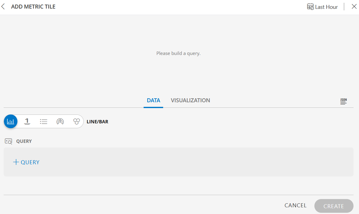
- Click the + QUERY and select the options from the following drop-down lists as you build the query:
- Metrics - Select any metric that is being sent to OpsRamp or an OpsRamp-generated metric.
- Filters - Select to filter the metrics based on the tags or labels that are present on those metrics.
- Operations - You can select multiple operations ranging from aggregations such as average or summation to mathematical functions like logarithms or absolute values.
The preview graph is displayed as you build the query.
- Alternatively, click </> to use the advanced query builder.
Click </> again to close the advanced query field and switch to the basic query builder format.
Note: If you make changes in the advanced query builder, you cannot switch back to the basic query builder. - Start typing a query and choose either a function or metric from the dropdown that appears, if you are using the advanced query option.
See https://prometheus.io/docs/prometheus/latest/querying/basics/ to learn about PromQL queries. - Click the optional Legend icon and enter {{ in the EDIT LEGEND field to see a list of options.
- Select the data type from the following options:
- Line/Bar - Displays a time series graph with metric values collected over a time interval.
- Value (single value) - Displays a single value.
- List - Displays values in a list format.
- Gauge - Displays multiple time series using a gauge graphic.
- Honeycomb - Displays multiple time series in a hexagonal graphic.
- Select an option and click SAVE to view the results based on your selection. Hover over the results on the preview graph to view them individually.
- Select the Value option to view the results as a single value. If there are more than one series, the single value does not display.
- You can sort the queries in ascending or descending order. This option is available for the List visualization.
- Select the Instant toggle to view the recent value for a given metric.
The Instant option is available only for List, Gauge, and Honeycomb chart types. - To customize the visualization further, click the Visualization tab.
- Click the Last Hour to select the duration for which the data needs to be retrieved. The duration can be selected for Last Hour, Last 4 Hours, Last 8 Hours, Last 24 Hours, Last 7 Days, Last 30 Days, and Month to Date.
- Click Create.
The Metric tile is created and displayed on the main dashboard page.
Examples
The following are example illustrations for each visualization:
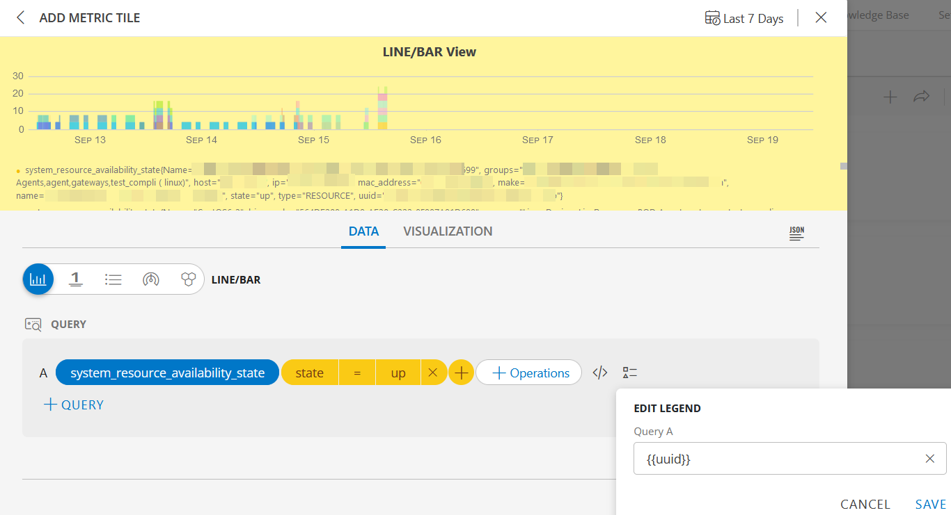
LINE/BAR visualization
The following is the LINE/BAR visualization with the inputs:
- Metric =
system_resource_availability_state - Filter =
state = up - Legend =
uuid
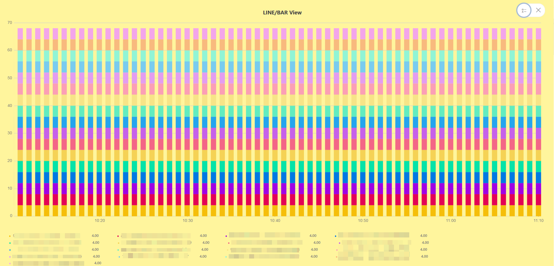
LINE/BAR dashboard view
The following is the LINE/BAR dashboard view:
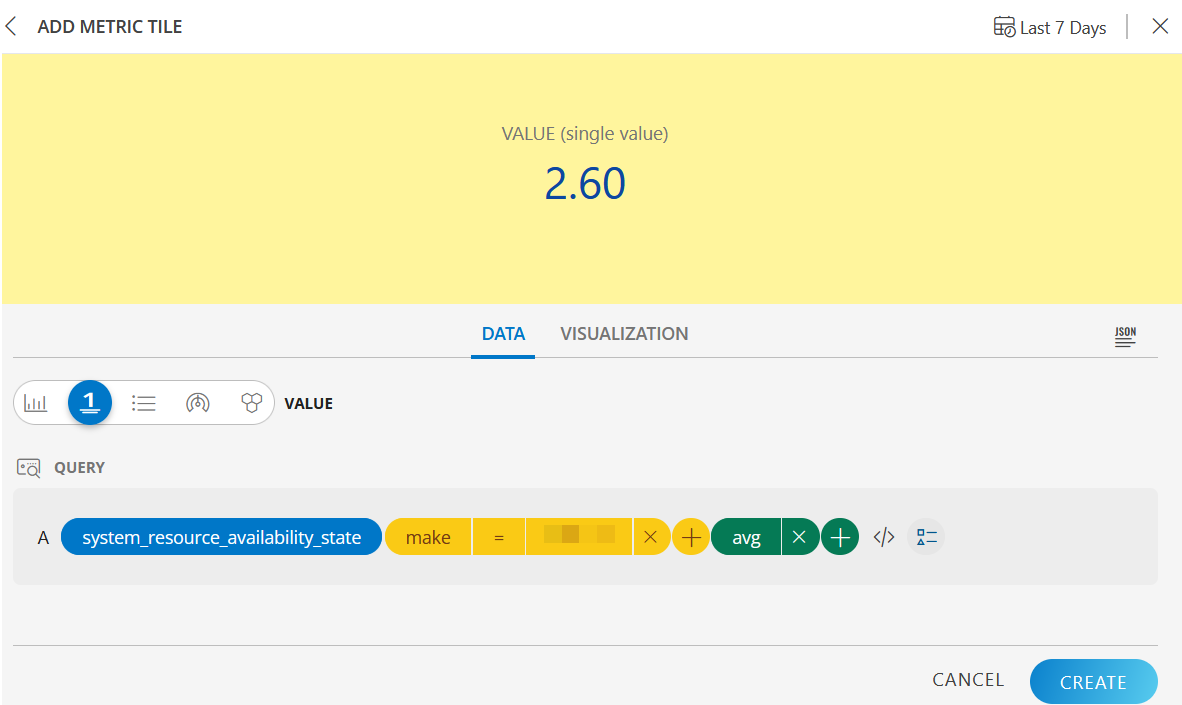
VALUE (single value) visualization
The following is the VALUE (single value) visualization with the inputs:
- Metric =
system_resource_availability_state - Filter =
make of the resource - Operations =
avg
VALUE (single value) dashboard view
The following is the VALUE (single value) dashboard view: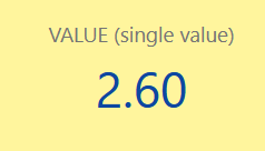
LIST visualization
The following is the LIST visualization with the inputs:
- Metric A =
system_resource_availability_state - Metric B =
system_service_map_availability_state - Filters for:
- Metric A =
state = up - Metric B =
state = up
- Metric A =
- Operations for:
- Metric A =
count - Metric B =
avg
- Metric A =
- Legend for Metric A and B =
{{uuid}} - Sort By =
Descending
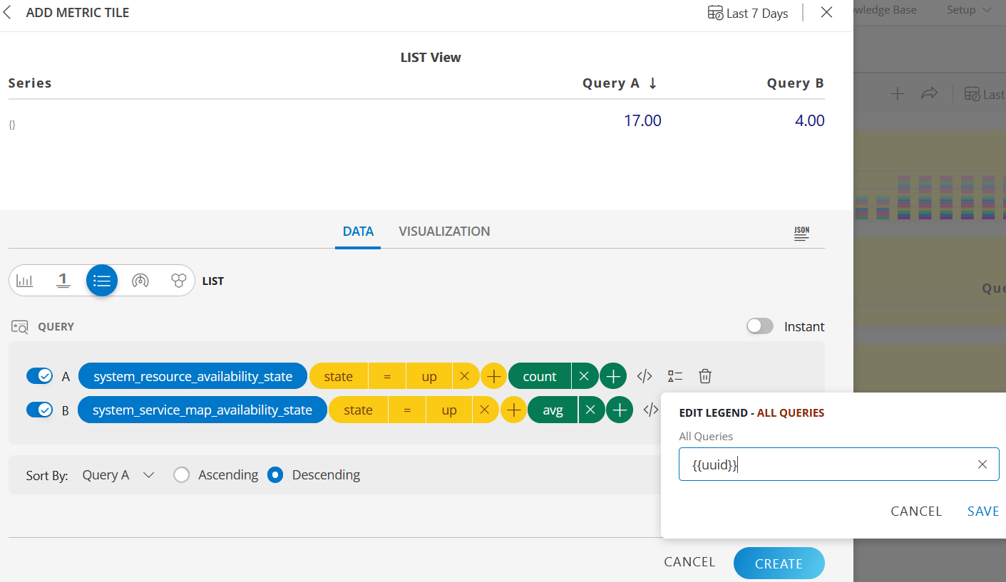
LIST dashboard view
The following is the LIST dashboard view:
GAUGE visualization
The following is the GAUGE visualization with the inputs:
- Metric =
system_service_map_availability_state
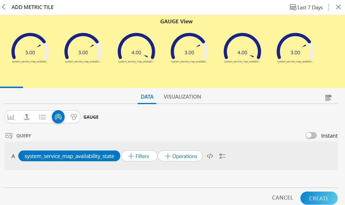
GAUGE dashboard view
The following is the GAUGE dashboard view: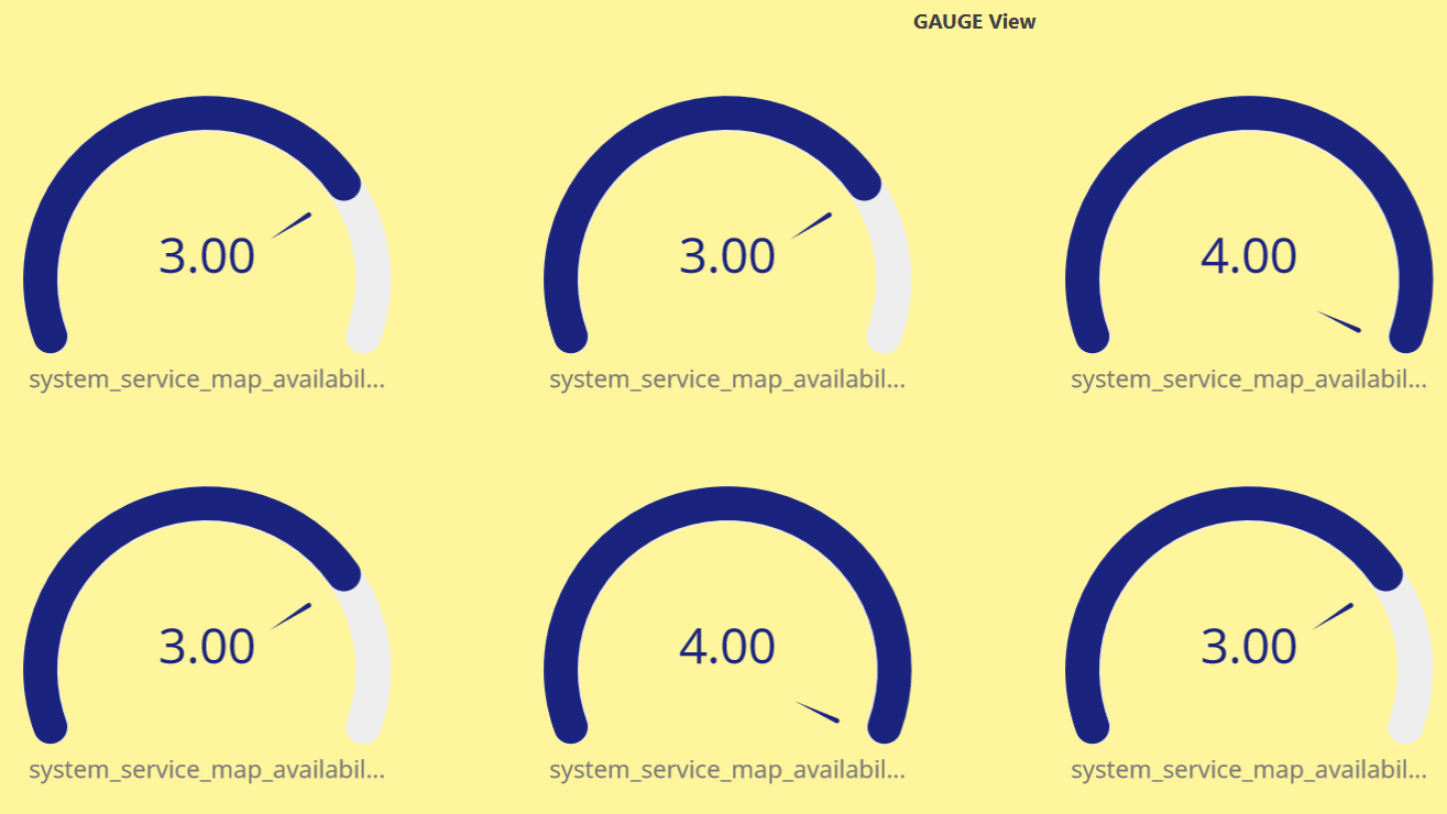
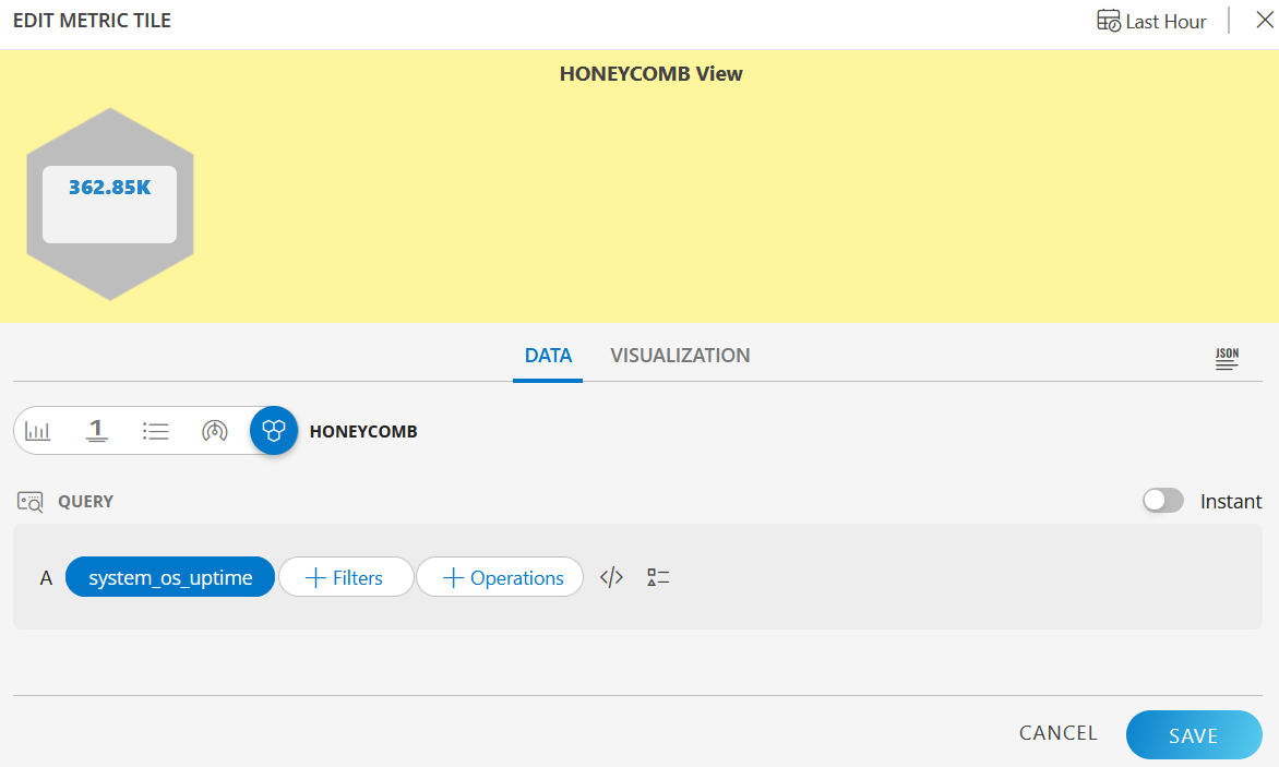
HONEYCOMB visualization
The following is the HONEYCOMB visualization with the inputs:
- Metric =
system_os_uptime
HONEYCOMB dashboard view
The following is the HONEYCOMB dashboard view: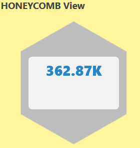
Create an Alert Tile
- From Dashboard, create a new dashboard or select from an existing dashboard collection.
- Click CREATE TILE or + from the toolbar.
- In the ADD TILE screen that appears, select ALERT.
The following screen is displayed: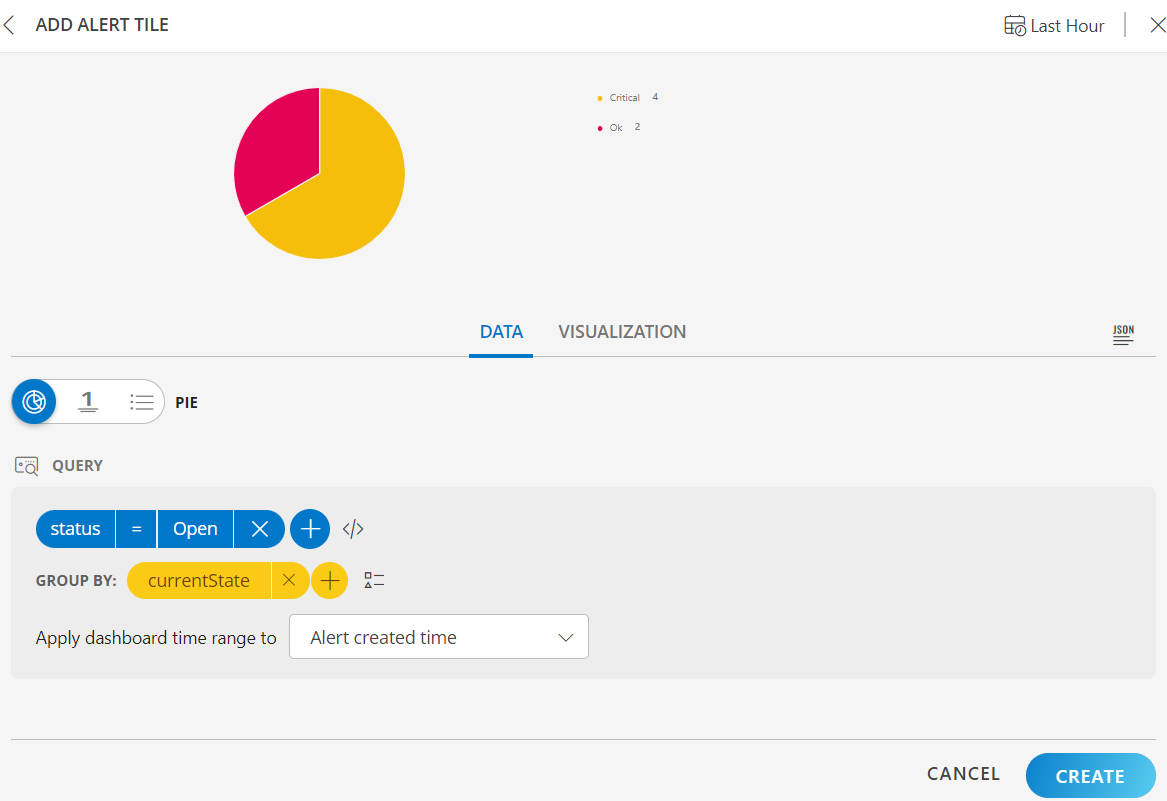
- Click the + QUERY and select the attributes from the drop-down list as you build the query. Click the + button to add additional attributes.
- You can combine multiple filters together to view only the required alerts.
The query is completed and the results are displayed in the preview graph.
- You can combine multiple filters together to view only the required alerts.
- Alternatively, click </> to use the advanced query builder.
Click </> again to close the advanced query field and switch back to the basic query builder format. - Enter a query or click inside the box to see a list of OpsQL attributes.
- Click the optional Legend icon and enter {{ in the EDIT LEGEND field to see a list of options.
- Select the visualization from the following options:
- Pie - Displays a pie chart.
- Single Value - Displays a single value.
- List - Displays values in a list format.
- From the GROUP BY option, select an attribute.
You can select up to two attributes.
In the List visualization, the second attribute values are displayed in a multi-column colored list.
The following is a sample illustration of a multi-column list: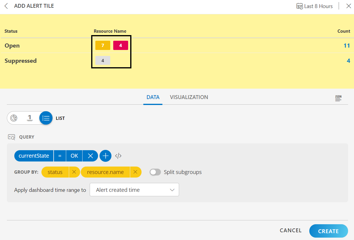
- Enable the Split subgroups toggle to view each grouping as a separate row.
Notes:- The multi-column list and split subgroup options are available for List chart only.
- The colors are displayed based on the default color categorization of alerts.
- Click the count or any column in the multi-column list to drill down and see the contextual list of alerts in the alerts browser.
- Select the time range from the Apply dashboard time range to option to view the alerts graphs based on:
- Alert created time: Alerts are filtered based on the alert created time and the graph is displayed.
- Alert updated time: Alerts are filtered based on the alert updated time and the graph is displayed.
- You can also customize the visualization.
- Click the Last Hour to select the duration for which the data needs to be retrieved. The duration can be selected for Last Hour, Last 4 Hours, Last 8 Hours, Last 24 Hours, Last 7 Days, Last 30 Days, and Month to Date.
- Click Create.
The Alert tile is created and displayed on the main dashboard page.
Examples
The following are example illustrations for each visualization:
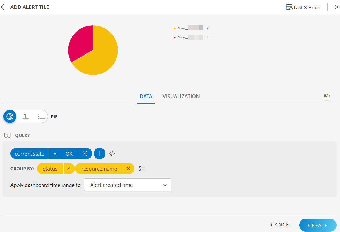
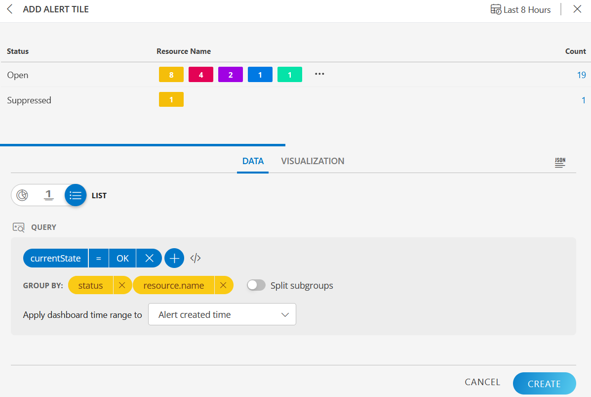
PIE visualization
The following is the PIE chart visualization with the inputs:
- Attribute -
currentState = OK - Group By
- Attribute 1 =
status - Attribute 2 =
resource.name
- Attribute 1 =
- Legend -
{{make}} - Dashboard time range =
Alert created time - Duration =
Last 8 Hours
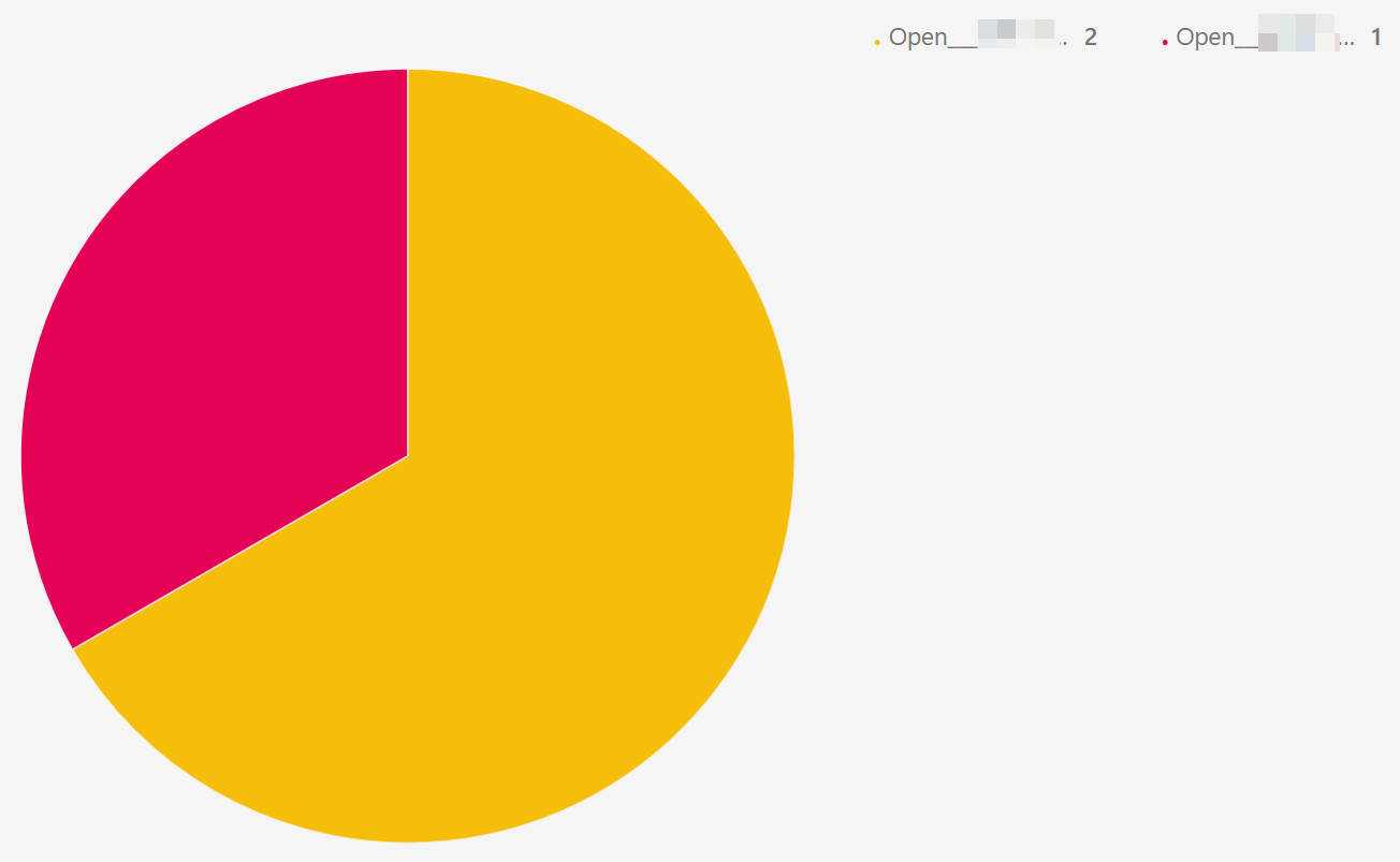
PIE dashboard view
The following is the PIE chart dashboard view:
SINGLE VALUE visualization
The following is the SINGLE VALUE visualization with the inputs:
- Attribute -
currentState = OK - Dashboard time range =
Alert created time - Duration =
Last 8 Hours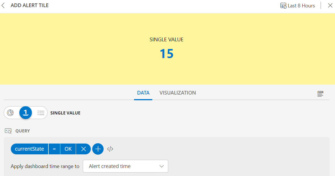
SINGLE VALUE dashboard view
The following is the SINGLE VALUE dashboard view: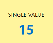
LIST visualization
The following is the LIST visualization with the inputs:
- Attribute -
currentState = OK - Group By
- Attribute 1 =
status - Attribute 2 =
resource.name
- Attribute 1 =
- Dashboard time range =
Alert created time - Duration =
Last 8 Hours - Split subgroups =
enabled
The Split subgroups option displays results with the attribute name. The following is a sample illustration: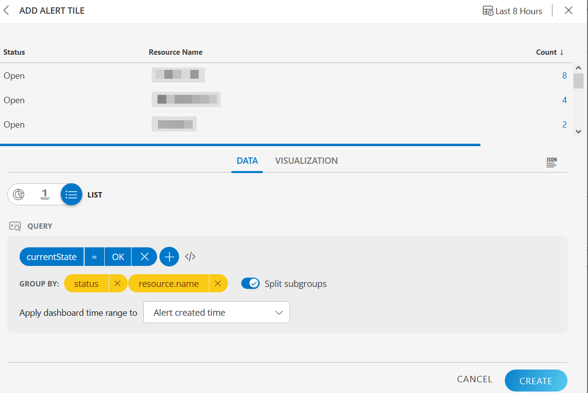
LIST dashboard view
The following is the LIST dashboard view: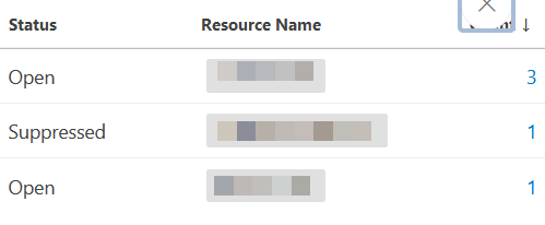
Tile Options
The following Tile options are available in the More Tile Options menu (three horizontal dots) next to a tile view in the main dashboard.
Note
The Edit and Remove tile options are available to a user if:
- The user has created the dashboard.
- The dashboard has been shared with the user and the user has admin privileges.
| Tile Option | Description |
|---|---|
| Edit | Edits a tile. |
| Copy | Copies a tile. |
| View JSON | Views the tile in a JSON file format. |
| Remove | Removes a tile. |
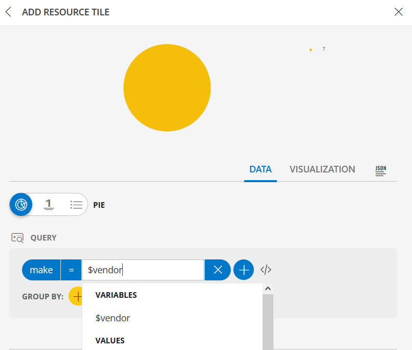
Create Dashboard Variables
Dashboard variables are created to assign specific attributes. These are used to filter the data with different attributes, without creating a new tile every time a change is required.
Note
The dashboard variables cannot be created for OPSRAMP CURATED DASHBOARDS.To create a variable, do the following:
Select a dashboard or create a new dashboard.
Click Filter in the main dashboard page. The MANAGE option appears.
Click MANAGE and in the MANAGE VARIABLE pop-up, provide the values to create variables. The following is an example:
- Variable Name - Vendor
- Attribute Name - make
- Default Value - select a value from the drop-down list
Click X to close the MANAGE and RESET options menu and view the toolbar.
Click +. The new variable is added and displayed on the main dashboard page.
You can perform the following actions on the variable:- Edit - click to edit the variable, and then click the tick mark to save the changes.
- Remove - click to remove the variable.
Create a Resource or an Alert tile. The newly created variable will be available for selection.
To edit the variable, click the variable from the main dashboard and select a different attribute from the list. Alternatively, click MANAGE and edit from the Actions. The chart is updated automatically with the changed data.
To use the previous value, click RESET.