Sometimes called a hexagonal chart or hexbin map, a honeycomb chart provides for more efficient data aggregation when binning data and is the most efficient division of 2D data space. It can also help eliminate data biases, such as the Alaska effect.
Example:
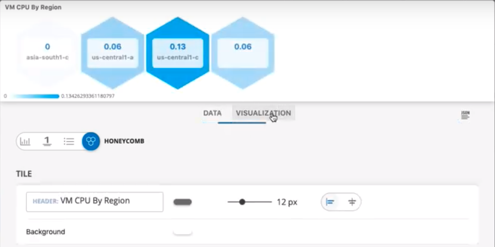
Click the image to redirect the visualization to the detailed view of the specific resource.