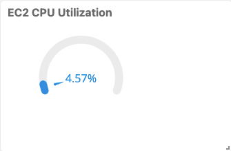
A Gauge chart uses a gauge visualization to represent each time series. A gauge displays a data value within a quantitative context, tracking the data value against a set target.
This chart supports the definition of multiple gauges within a tile, with the metric value displayed at a point in time. Click the image to redirect the visualization to the detailed view of the specific resource.
Example: