Introduction
A Tile is used to configure and visualize different metrics using the basic or advanced PromQL or OpsQL query builder. A collection of tiles is called a Dashboard.
The following steps let you create a Tile visualization from a query:
Create the Dashboard.
See Create Dashboards to learn about creating dashboards.Select from the following tiles:
Build a PromQL or OpsQL query using the basic or advanced query building to populate your visualization. In the basic query option, the metrics, filters, operations, attributes, and values are displayed and you can build the query by clicking +QUERY field and selecting each value from the drop down list. For example, consider the following:
- Metric =
system_cpu_load - Filter =
avg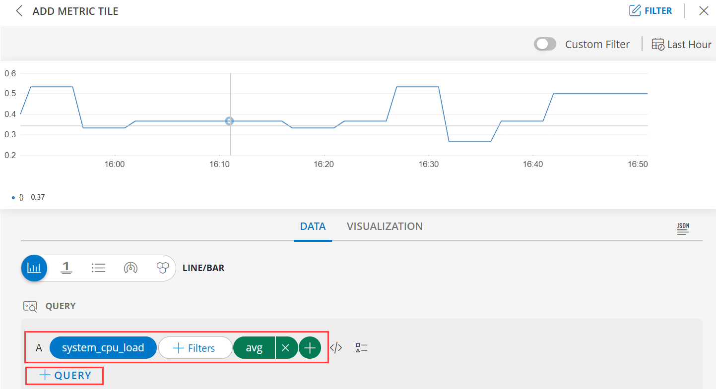
- Metric =
In the advanced query option, build a query by clicking the </> to use the advanced query builder and start typing the query and complete the query. For example, consider the following:
- Attribute =
status - Operator =
= - Value =
Open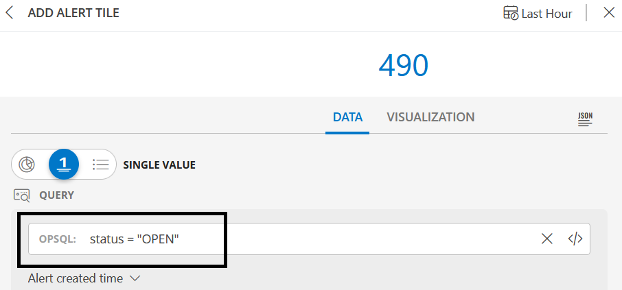
- Attribute =
Select from the available chart types:
- Line/Bar - displays multiple time series as a graph or bar graphic.
- Single Value - displays a single value.
- List - displays values in a list format.
- Gauge - displays multiple time series using a gauge graphic.
- Honeycomb - displays multiple time series in a hexbin or hexagonal graphic.
- Pie - displays values in a pie graph.
- Area - displays values in a colored block format.
Customize the visualization.
View the dashboard on the main dashboard page.
Note:
- In dashboard 2.0:
- There is no created or updated time in resource tile.
- In alert tile, you will not be able to use the ‘createdTime’ or ‘UpdatedTime’ attributes in second groupBy.
- There is a limitation of 30 resources per tile.
- For metric tiles, there is a default refresh rate of 3 minutes (180 seconds). However, for other tiles, only manual refresh is available to enhance dashboard performance, as regular refresh may not be necessary.
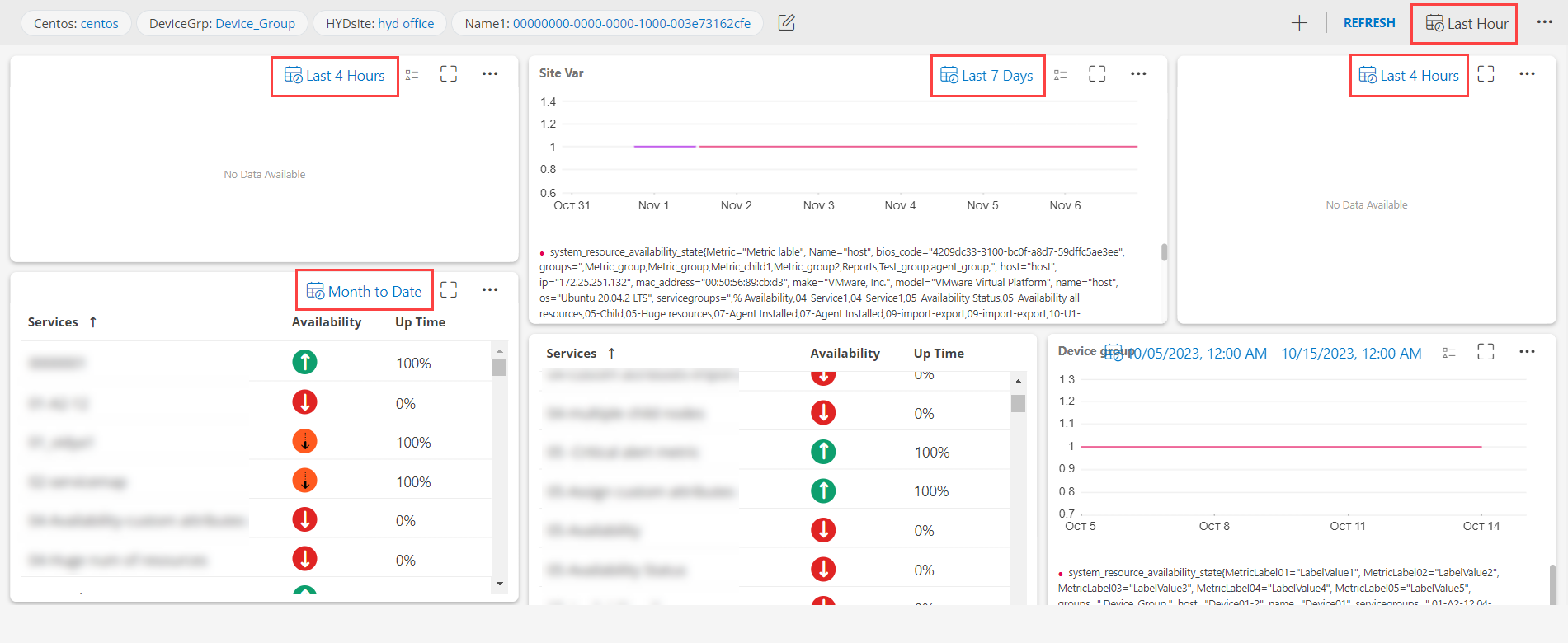
- You have the flexibility to define a specific time-period for Tiles that is independent from the dashboard’s overall time-period.
Tile Options
The following Tile options are available in the More Tile Options menu (three horizontal dots) next to a tile view in the main dashboard.
Note
The Edit and Remove tile options are available to a user if:
- The user has created the dashboard.
- The dashboard has been shared with the user and the user has admin privileges.
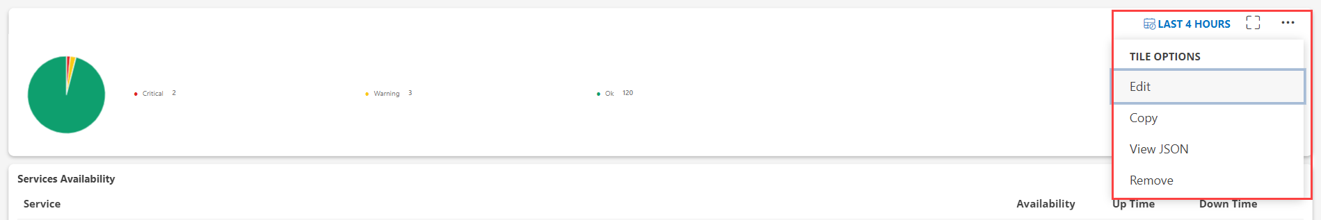
| Tile Option | Description |
|---|---|
| Edit | Edits a tile. |
| Copy | Copies a tile. |
| View JSON | Views the tile in a JSON file format. |
| Remove | Removes a tile. |