A List chart displays metric values in a two column list.
Create a List chart
- From the Dashboard 2.0, click + and select METRIC tile, and select List as the chart type.
- In the Query A, enter the PromQL query for the required metric.
For example:
system_disk_used_space - Click Add Query to create another query field.
- In the Query B, enter the PromQL query for the required metric.
For example:
system_disk_free_space - In the optional Label fields, provide label names. If you do not provide a name, by default, the labels will appear as Query A and Query B.
- Sort the fields by ascending or descending order. Customize your charts using the options in the Visualization tab.
- Click Create.
The metric values are displayed in a two column list. The list provides information about different resources that match the query.
Example:
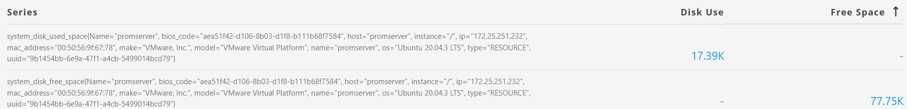
To view two different metric values for the same resource side by side, configure the common attributes such as name and operating system information in the Legend field.
Example:
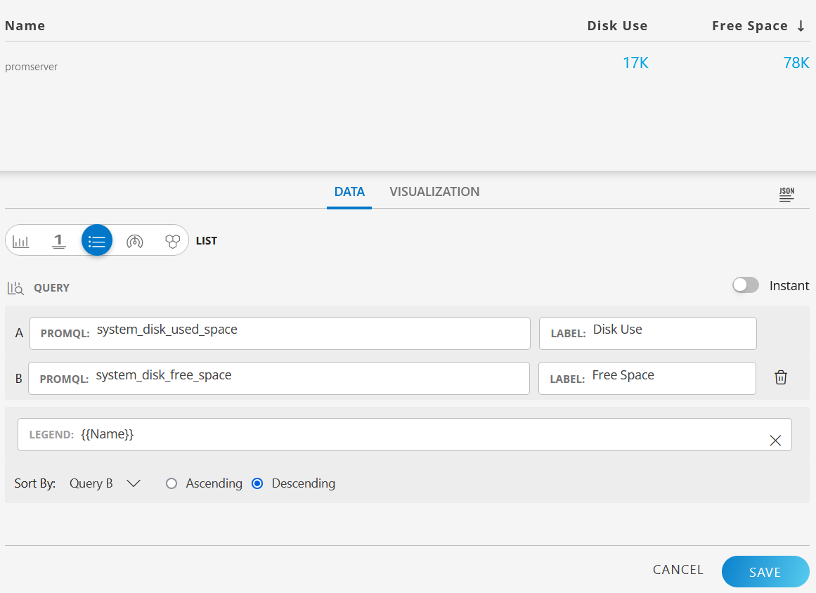


Click the Legend field to redirect the visualization to the detailed view of the specific resource.
Refer to the Dashboard 2.0 section to learn more about creating dashboards.
Refer to the PromQL Query Builder section to learn in detail about using the PromQL query definitions.
List Visualization for Metric Tile
Text value display for resource and service availability
For the system_resource_availability_state and system_service_map_availability_state metrics, the status is displayed as both label (text) and numeric value. The following are the values:
- Up
- Down
- Unknown
- Degraded
By default, the status is shown as a text value. To view the status as a numeric value, clear the Show as label selection in the Visualization tab.
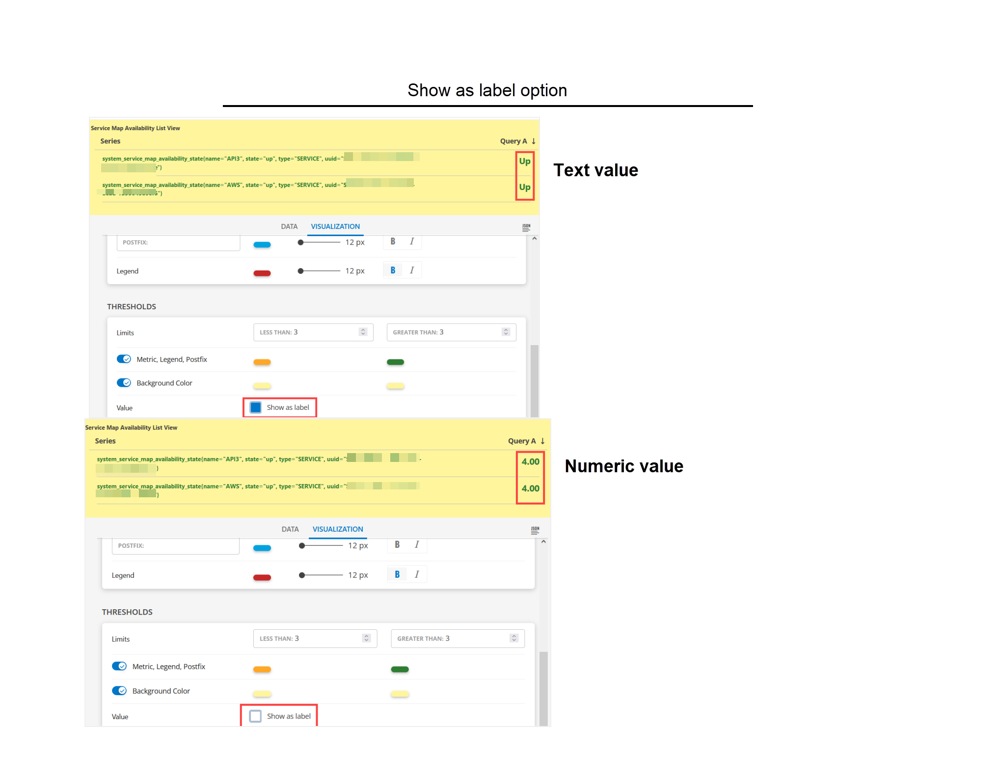
The text status display option is available for List, Gauge, and Honeycomb visualizations only.
system_resource_availability_state
The system_resource_availability_state metric monitors the availability of the resources and displays the status as a numeric or text value. The following are the available values:
- 1 - Unknown
- 3 - Down
- 4 - Up
Sample Illustrations
The following are the sample illustrations for each visualization and its respective dashboard view:
LIST visualization
The following is the LIST visualization: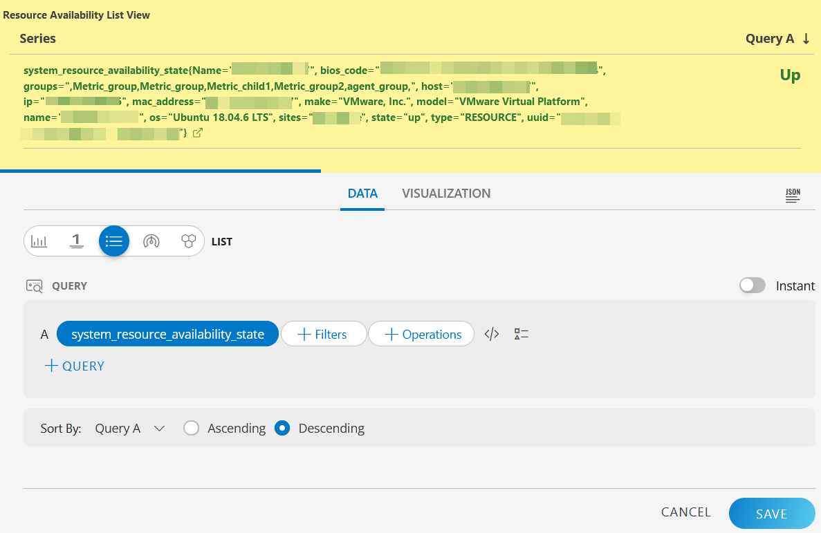
LIST dashboard view
The following is the LIST dashboard view: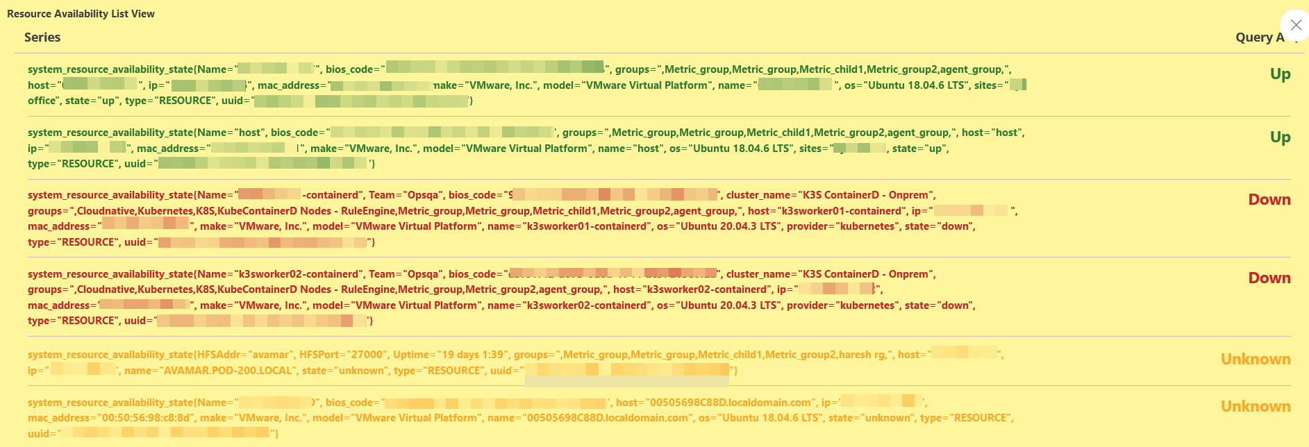
Text value display for resource and service availability
For the system_resource_availability_state and system_service_map_availability_state metrics, the status is displayed as both label (text) and numeric value. The following are the values:
- Up
- Down
- Unknown
- Degraded
By default, the status is shown as a text value. To view the status as a numeric value, clear the Show as label selection in the Visualization tab.
The text status display option is available for List, Gauge, and Honeycomb visualizations only.
system_resource_availability_state
The system_resource_availability_state metric monitors the availability of the resources and displays the status as a numeric or text value. The following are the available values:
- 1 - Unknown
- 3 - Down
- 4 - Up
Sample Illustrations
The following are the sample illustrations for each visualization and its respective dashboard view:
LIST visualization
The following is the LIST visualization:
LIST dashboard view
The following is the LIST dashboard view:
system_service_map_availability_state
The system_service_map_availability_state metric monitors the availability of the service maps and displays the status as a numeric or text value. The following are the available values:
- 2 - Degraded
- 3 - Down
- 4 - Up
Sample Illustrations
The following are the sample illustrations for each visualization and its respective dashboard view:
LIST visualization
The following is the LIST visualization: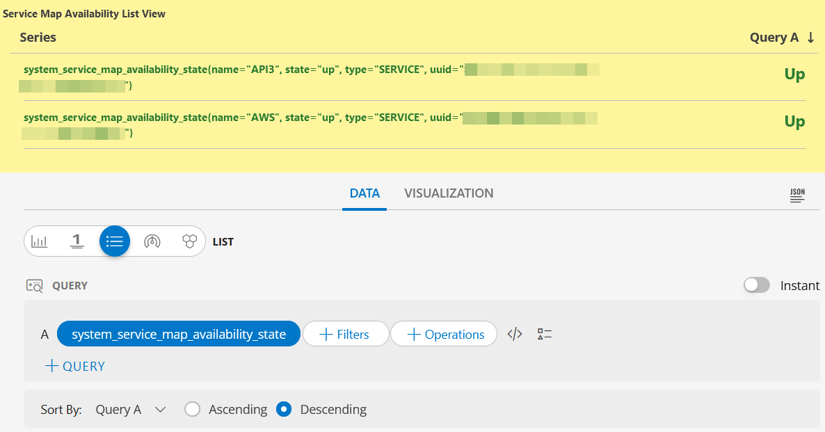
LIST dashboard view
The following is the LIST dashboard view: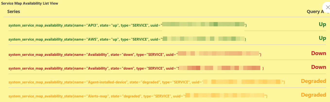
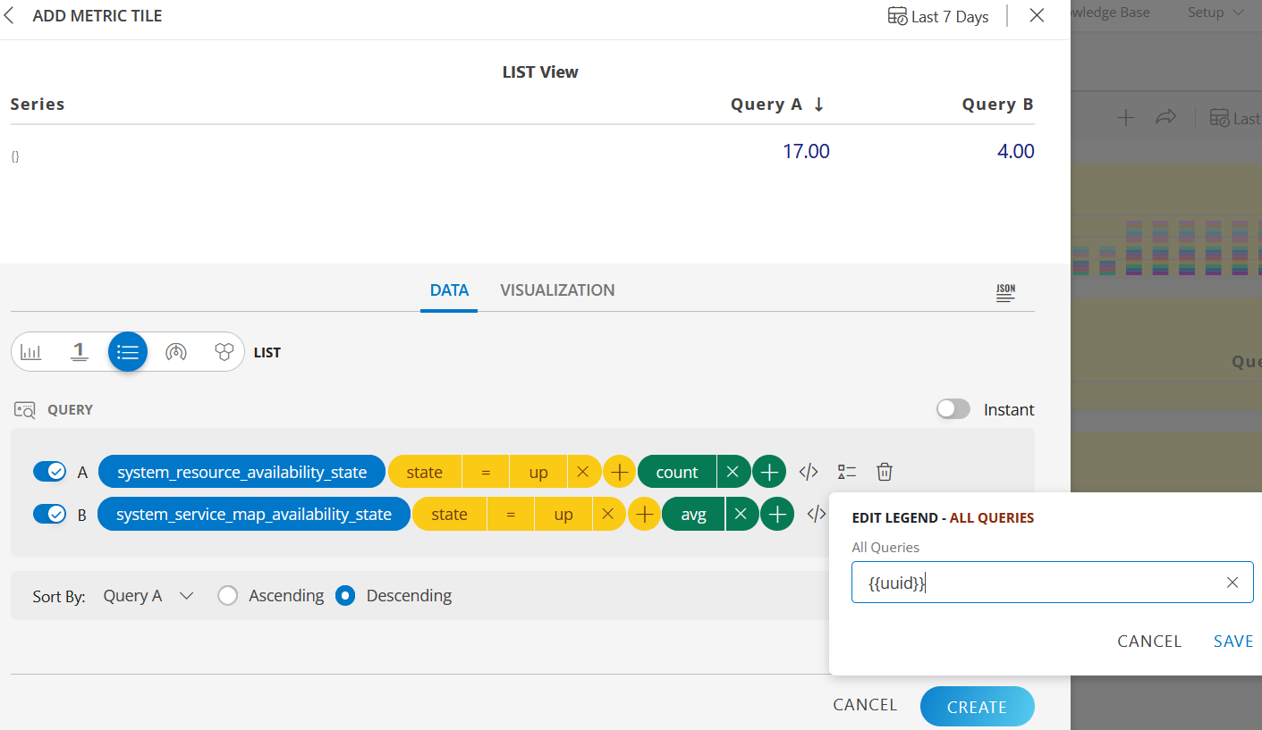
LIST visualization
The following is the LIST visualization with the inputs:
- Metric A =
system_resource_availability_state - Metric B =
system_service_map_availability_state - Filters for:
- Metric A =
state = up - Metric B =
state = up
- Metric A =
- Operations for:
- Metric A =
count - Metric B =
avg
- Metric A =
- Legend for Metric A and B =
{{uuid}} - Sort By =
Descending
LIST dashboard view
The following is the LIST dashboard view:
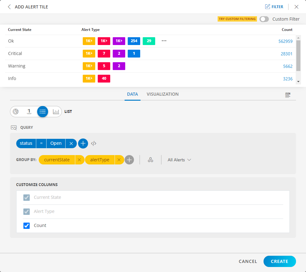
List Visualization for Alert Tile
LIST visualization
The following is the LIST visualization with the inputs:
Attribute -
currentState = OKGroup By
- Attribute 1 =
type - Attribute 2 =
aliasName
- Attribute 1 =
CUSTOMIZE COLUMNS:
- Current State
- alertType
Note: It is not possible to uncheck all the ‘Group By’ options. Only the client has the ability to do so.
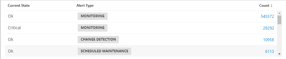
The Split subgroups option displays results with the attribute name. The following is a sample illustration: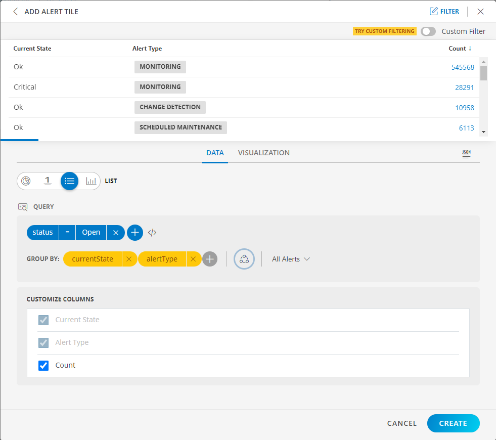
LIST dashboard view
The following is the LIST dashboard view:
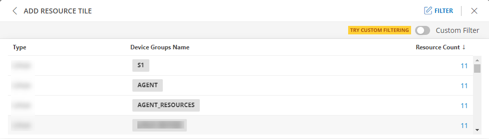
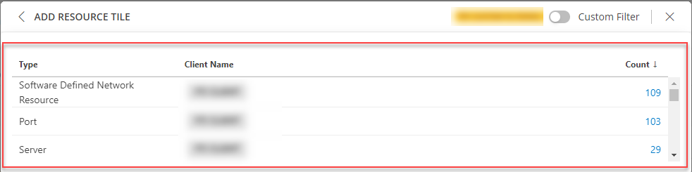
List Visualization for Resource Tile
LIST visualization
The following is the LIST visualization with the inputs:
- Attribute -
entityType = RESOURCE AND hasRelationship = true - Group By
- Attribute 1 =
type - Attribute 2 =
aliasName
- Attribute 1 =
- Split subgroups =
enabled - Dashboard time range =
All Tickets
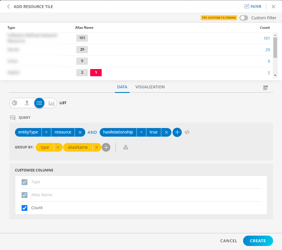
The Split subgroups toggle switch displays results with the attribute name. The following is a sample illustration:
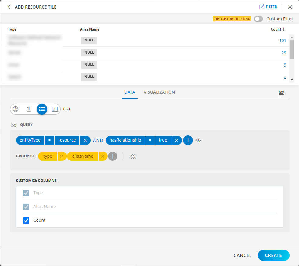
LIST dashboard view
The following is the LIST dashboard view:
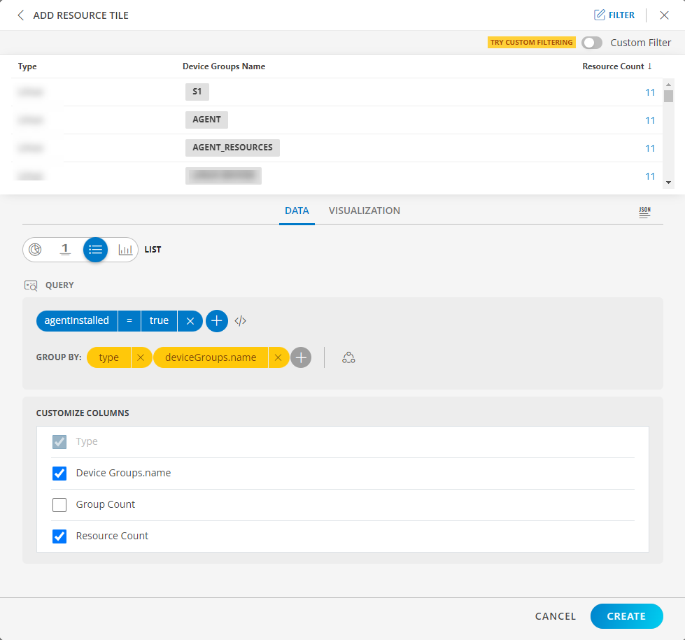
List Visualization for Ticket Tile
LIST visualization
The following is the LIST visualization with the inputs:
- Attribute -
agnetInstalled = true - Group By
- Attribute 1 =
type - Attribute 2 =
deviceGroups.name
- Attribute 1 =
- Split subgroups =
disabled
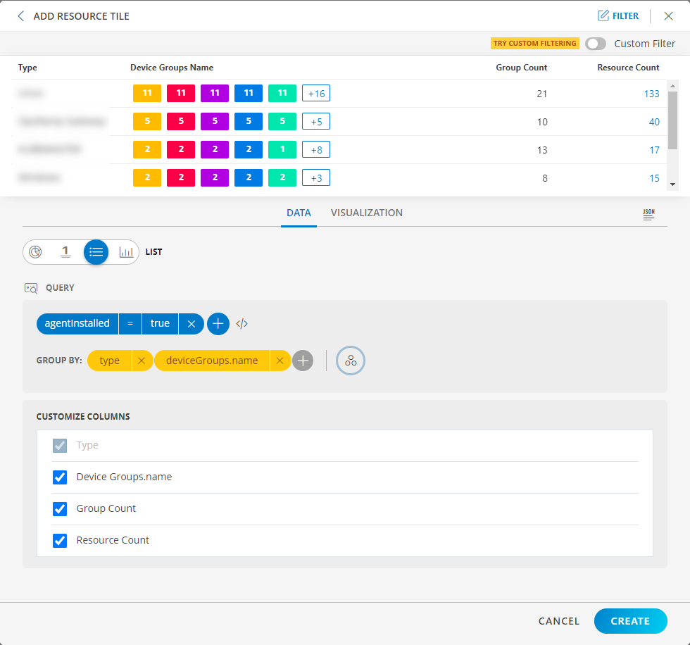
Notes:
- When two group bys are provided then Group Count is displayed and by default it is disabled.
- If Group Count is enabled the second group bys count should be displayed.
- Drill down is not possible on Group Count.
- Group Count displays the second group by count.
The Split subgroups toggle switch displays results with the attribute name. The following is a sample illustration:
LIST dashboard view
The following is the LIST dashboard view: