Introduction
Sometimes called a hexagonal chart or hexbin map, a honeycomb chart provides for more efficient data aggregation when binning data and is the most efficient division of 2D data space. It can also help eliminate data biases, such as the Alaska effect.
Example:
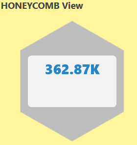
HONEYCOMB visualization for Metric Tile
Visualization is scaled to 500 entities for all tile types that can define range and thresholds. Hovering over the tile will give the details of the resource/metric value and name.
Text value display for resource and service availability
For the system_resource_availability_state and system_service_map_availability_state metrics, the status is displayed as both label (text) and numeric value. The following are the values:
- Up
- Down
- Unknown
- Degraded
By default, the status is shown as a text value. To view the status as a numeric value, clear the Show as label selection in the Visualization tab.
Note
In order to support redirection to resource in the honeycomb, the user needs to user bothtype and uuid in the PromQL query.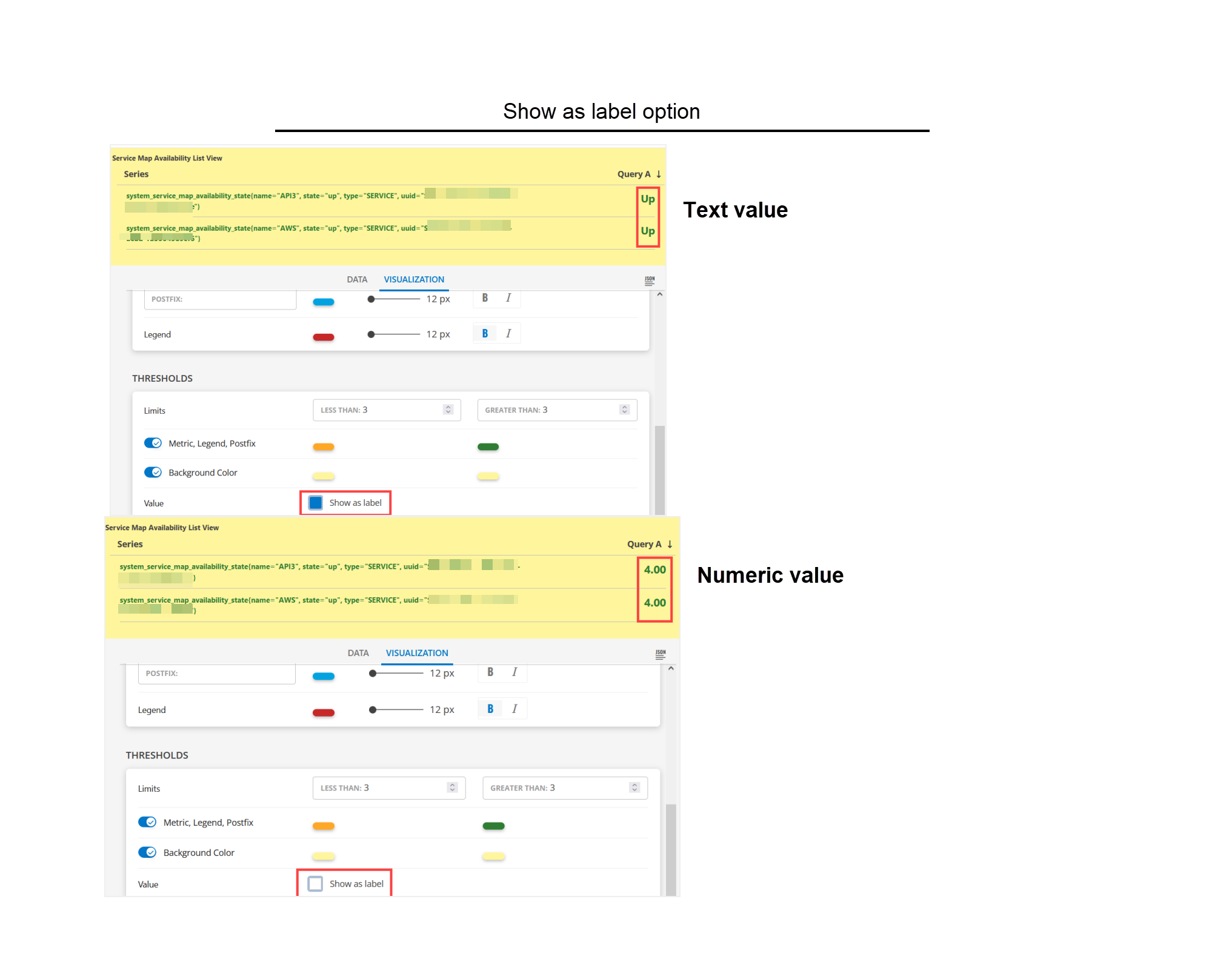
The text status display option is available for List, Gauge, and Honeycomb visualizations only.
system_resource_availability_state
The system_resource_availability_state metric monitors the availability of the resources and displays the status as a numeric or text value. The following are the available values:
- 1 - Unknown
- 3 - Down
- 4 - Up
Sample Illustrations
The following are the sample illustrations for each visualization and its respective dashboard view:
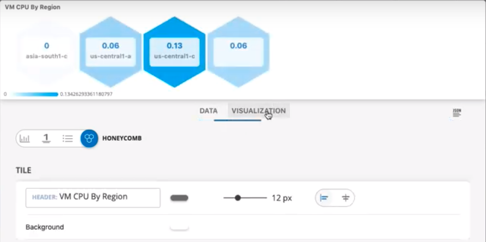
The following is the HONEYCOMB visualization: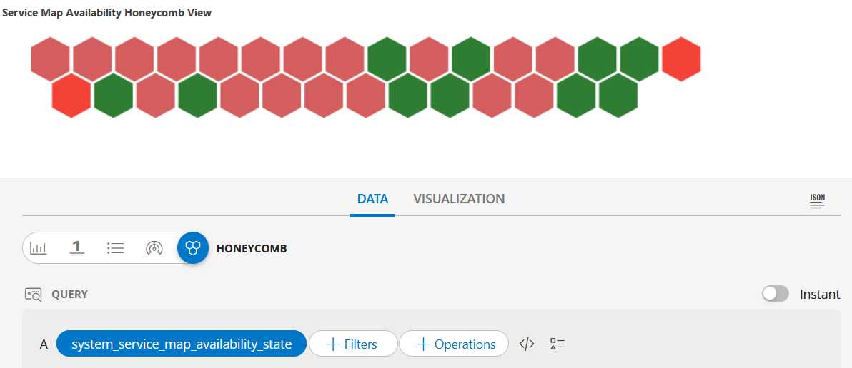
HONEYCOMB dashboard view
The following is the HONEYCOMB dashboard view: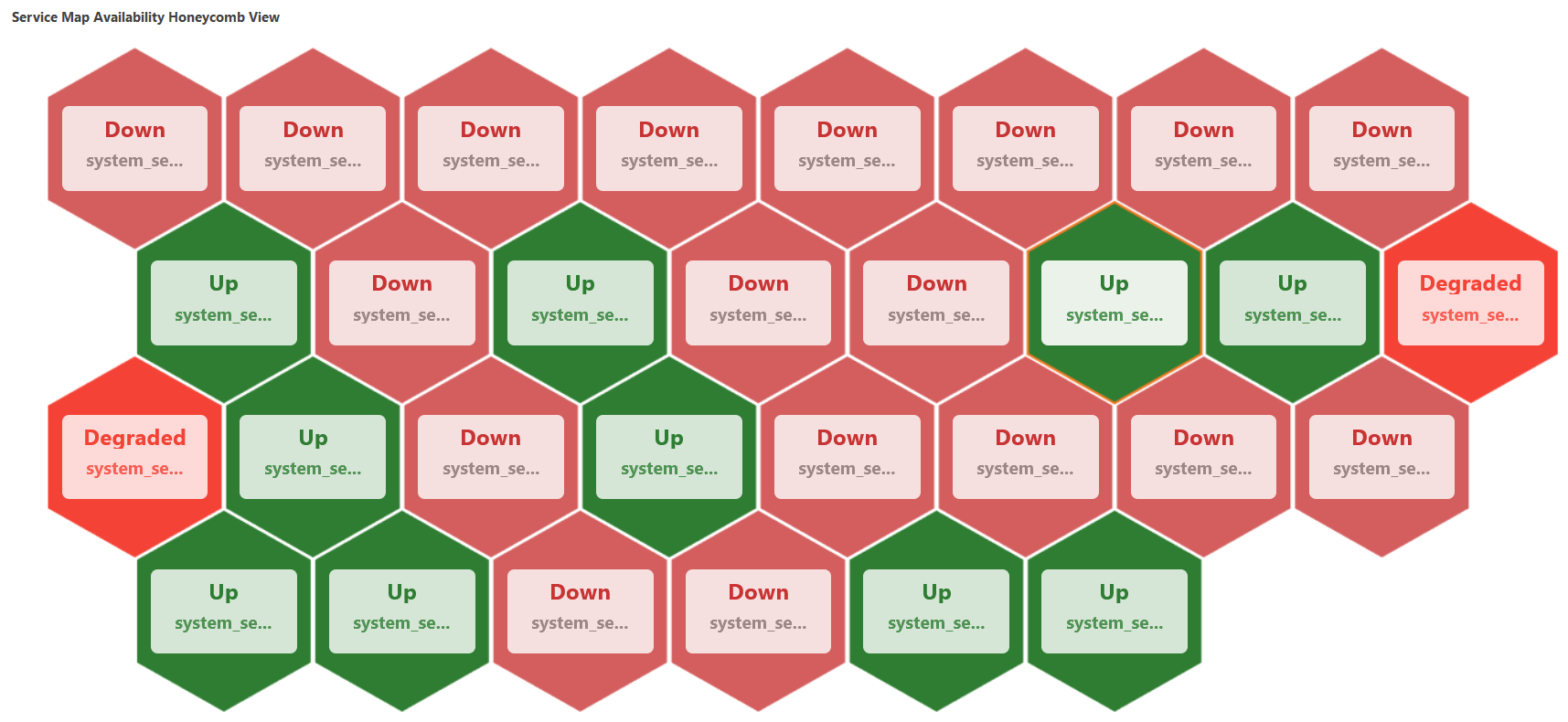
The following is the HONEYCOMB visualization: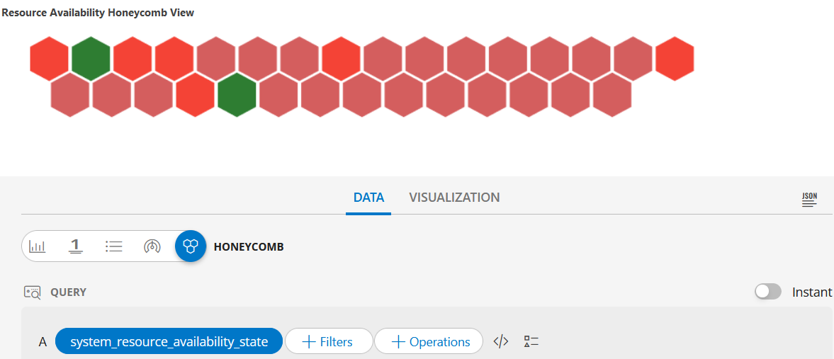
HONEYCOMB dashboard view
The following is the HONEYCOMB dashboard view: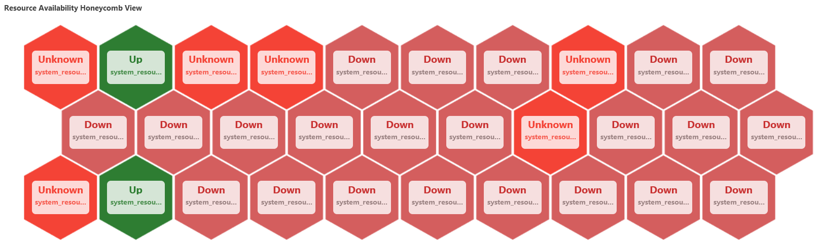
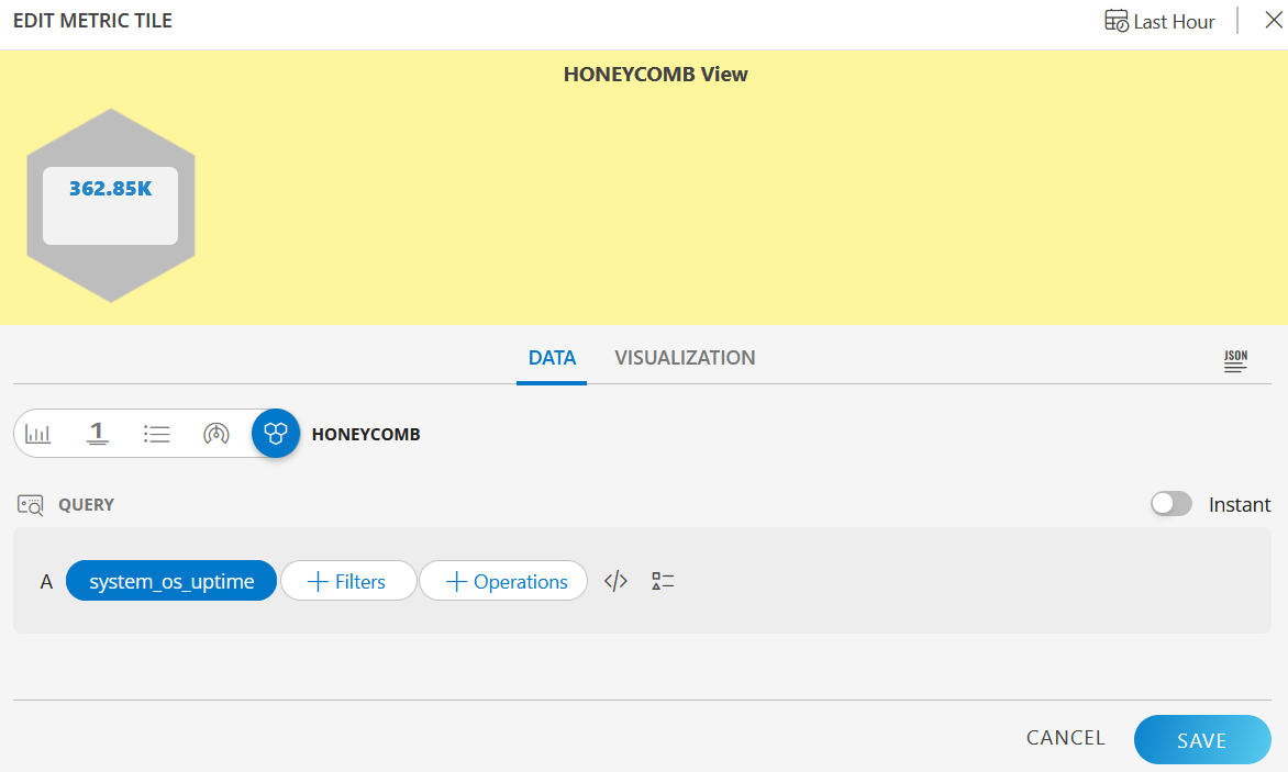
HONEYCOMB visualization
The following is the HONEYCOMB visualization with the inputs:
- Metric =
system_os_uptime
HONEYCOMB dashboard view
The following is the HONEYCOMB dashboard view: