Introduction
A Gauge chart uses a gauge visualization to represent each time series. A gauge displays a data value within a quantitative context, tracking the data value against a set target.
This chart supports the definition of multiple gauges within a tile, with the metric value displayed at a point in time. Click the image to redirect the visualization to the detailed view of the specific resource.
Example:
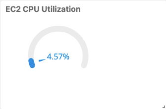
GAUGE visualization for Metric Tile
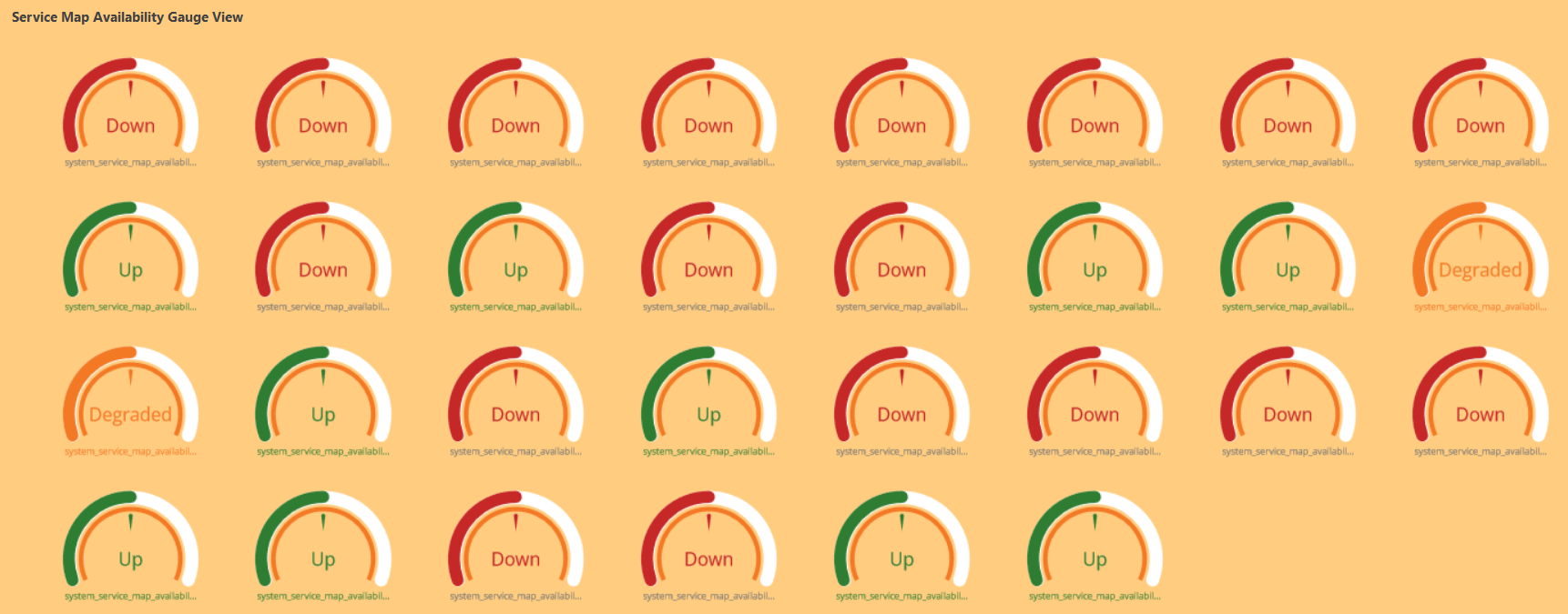
Text value display for resource and service availability
For the system_resource_availability_state and system_service_map_availability_state metrics, the status is displayed as both label (text) and numeric value. The following are the values:
- Up
- Down
- Unknown
- Degraded
By default, the status is shown as a text value. To view the status as a numeric value, clear the Show as label selection in the Visualization tab.
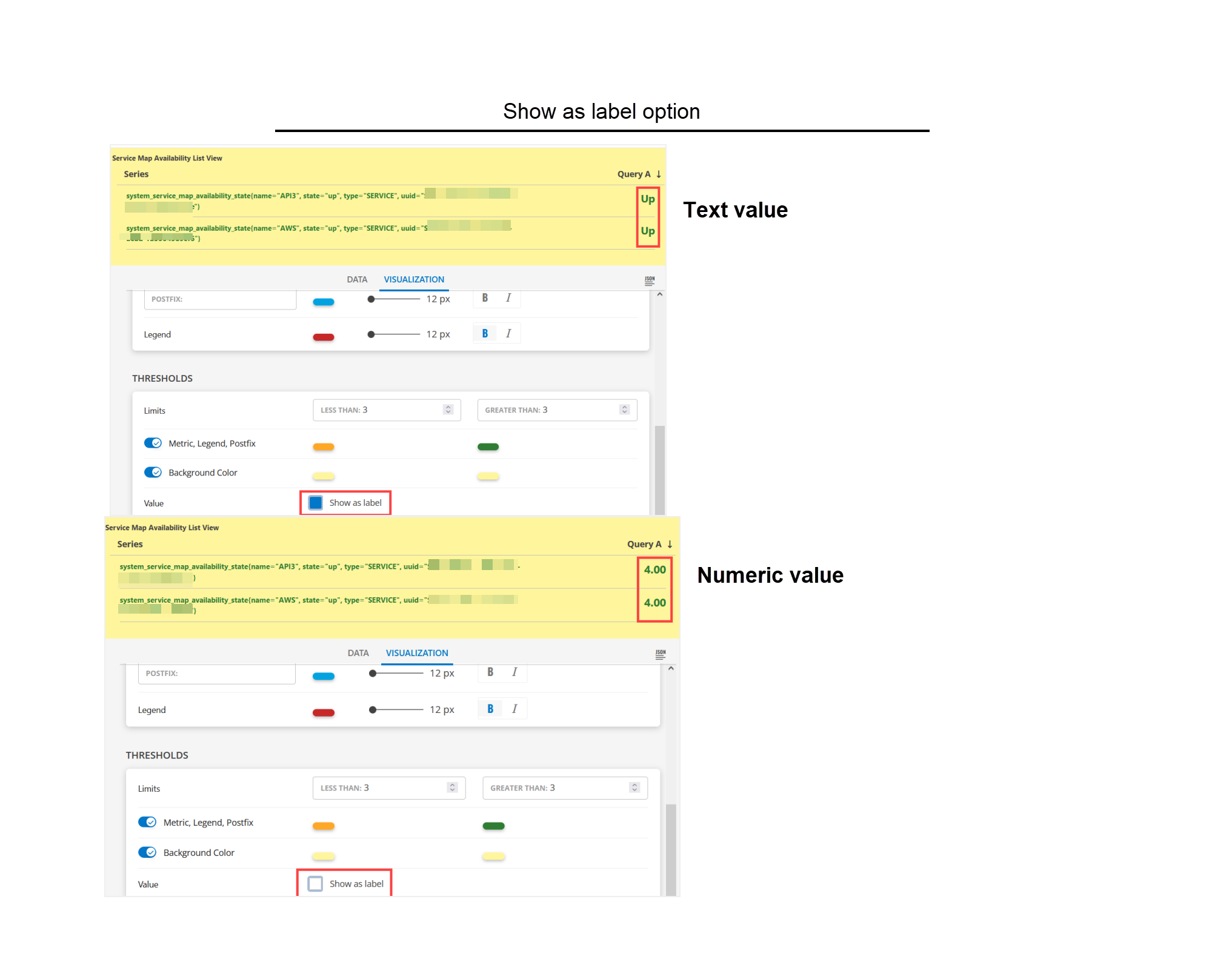
The text status display option is available for List, Gauge, and Honeycomb visualizations only.
system_resource_availability_state
The system_resource_availability_state metric monitors the availability of the resources and displays the status as a numeric or text value. The following are the available values:
- 1 - Unknown
- 3 - Down
- 4 - Up
Sample Illustrations
The following are the sample illustrations for each visualization and its respective dashboard view:
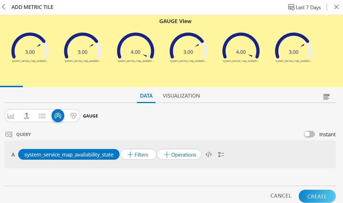
GAUGE visualization
The following is the GAUGE visualization: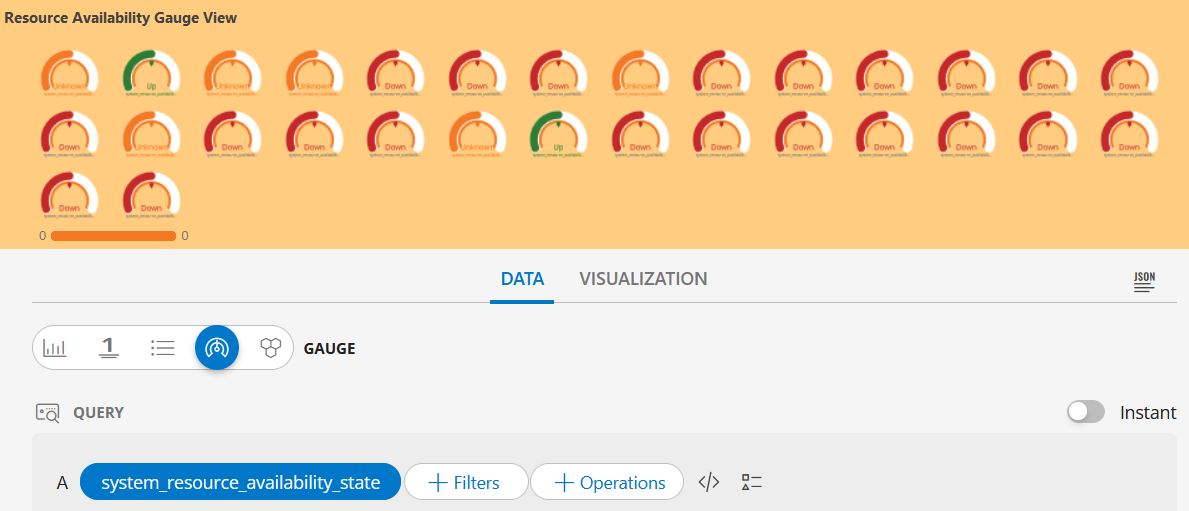
GAUGE dashboard view
The following is the GAUGE dashboard view: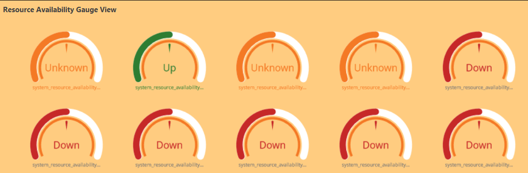
The following is the GAUGE visualization with the inputs:
- Metric =
system_service_map_availability_state
GAUGE dashboard view
The following is the GAUGE dashboard view: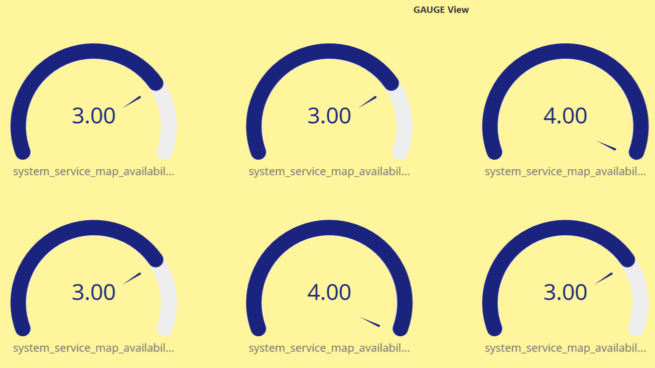
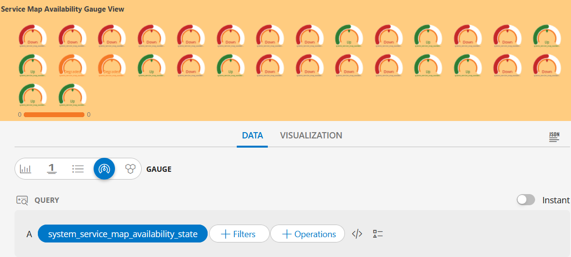
GAUGE visualization
The following is the GAUGE visualization:
GAUGE dashboard view
The following is the GAUGE dashboard view: