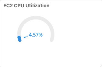
OpsRamp provides customizable charts for visualizing your data. Matching the chart type to the information you want to extract from your data can provide an increased understanding of the data.
A chart is populated by the data geted from a PromQL or OpsQL query. All metric tiles, except Value, have a 30-series limit.
Chart index
 |  |  | |
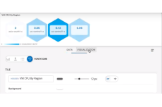 |  |  |
Customization options
The following options are provided for customizing charts:
| Field/Element | Description |
|---|---|
| Header Label | Add a title to your chart. |
| Grid Lines | Enable or disable grid lines. |
| Background | Change the background color. |
| Display | Toggle between Line and Bar charts. |
| Legend | Enable or disable a legend display. |
| Data Color Mapping | Change the color of each series. Color palettes are customizable for combo charts only. |
| Axis | Enter and customize axes labels. |
| Thresholds | Configure the chart to change color and background color when a specified threshold or condition is reached. This applies only to value and list chart types. |
Enhanced tile visualization features
Textual tiles
Textual tiles can be used to provide dashboard messages and descriptions.
Image tiles
Images can be uploaded as tiles.