Introduction
Dashboard 2.0 provides an at-a-glance view of the performance and health of your infrastructure and services. Powered by the UI-based or the advanced Prometheus Query Language (PromQL) and OpsQL queries, you can query metrics for most use cases to quickly identify issues.
Dashboard 2.0 permits you to:
- Visualize any data collected using flexible queries.
- Customize charts for personalized data visualization.
- Leverage out-of-the-box content to get metrics from commonly used services.
- Create new dashboards and reuse existing dashboards for easy portability.
- Create data-rich charts using PromQL and OpsQL.
The following steps let you create a Dashboard 2.0 visualization from a PromQL or OpsQL basic or advanced query building options:
- Create the dashboard.
- Create a Metric, Service, Alert, Resource, Ticket, Text & Image, Schedule, and Embed tiles.
- Specify a PromQL or OpsQL query to populate your visualization.
- Select from Line/Bar, Value, List, Gauge, Honeycomb, or Pie chart type.
- Customize the visualization.
- View the dashboard on the main dashboard page.
For example, choosing a value chart populated by a sum(usage_cloud_provider_aws) PromQL query gives you the following visualization:

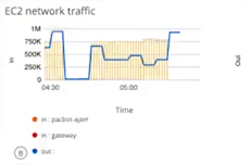
Or, choosing a combo chart to graph the inbound and outbound traffic on an ec2 instance using a usage_cloud_provider_aws{instance="ec2.instances"} PromQL query displays:
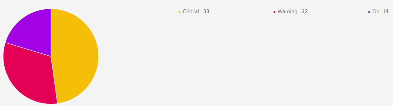
Or, choosing a pie chart populated by a $alertType = "Monitoring" OpsQL query displays:
In all, you can choose from six charts, described in more detail in Charts, choosing the one that best represents your data and use case:
- Line/Bar displays values in a line or bar graphic.
- Value displays a single value.
- List displays values in a list format.
- Gauge displays multiple time series using a gauge graphic.
- Honeycomb displays multiple time series in a hexbin or hexagonal graphic.
- Pie displays values in a pie chart format.
Learn more about individual chart types in the Chart Library.
Tile category mapped to Widgets
| Alert Tile | Service Tile | Metric Tile | Resource Tile | Ticket Tile | Maintanence Tile | Image Tile | Text Tile |
|---|---|---|---|---|---|---|---|
| Alert trend | Service Availability | Metric Timeseries | Custom attributes | Service Desk | Schedule maintenance stats | Image | Text |
| Resources list by alert volume | Service Status | Metric Value | Inventory by type | ||||
| Alert Volume | Metric List | Inventory by OS | |||||
| Geo-map alerts | Top metric utilization | Site Availability | |||||
| Resources Distribution by metric | Resource Group Availability | ||||||
| Device count by metric | Patch status | ||||||
| Patch pending approvals | |||||||
| Geo map Resources | |||||||
| Resource Availability | |||||||
| Network backup status |
Conversion Tool
The classic dashboard has Migrate option.
This will automatically create an equivalent Dashboard 2.0.
Follow these steps to migrate the classic dashboard to Dashboard 2.0:
- Navigate to DASHBOARDS → Classic Dashboard.

- Click Migrate. The Overall Classic Dashboard Conversation Status popup window is displayed.

- Following are the details available in the window:
- Overall Classic Dashboard Conversion Status: Displays the status of the conversion: Success or Failed.
A Failed message is displayed, if the dashboard has already been converted. - Total Classic Widgets: Number of widgets available in the classic dashboard.
- Failed Widget Count: Number of widgets that are not supported in Dashboard 2.0.
- Successful Widget Count: Number of widgets that are successfully migrated to Dashboard 2.0.
- Failure Widget List: The list of widgets that failed to migrate. The reason for failure is provided.
Example: Widget is not supported in Dashboard 2.0. - Navigate to Migrated Dashboard: Click the link to navigate to Dashboard 2.0. All the migrated widgets are converted into tiles and displayed.
- Overall Classic Dashboard Conversion Status: Displays the status of the conversion: Success or Failed.
Classic Dashboards vs Dashboard 2.0
Dashboards are essential for visualizing and analyzing data efficiently. Over time, dashboard platforms have evolved, introducing new features, improved usability, and enhanced customization options. This document provides a parity comparison between Classic Dashboards and Dashboards 2.0, highlighting key differences and feature improvements.
Understanding these differences will help you transition smoothly to Dashboards 2.0 while leveraging its advanced capabilities. Below is a detailed list comparing the two versions.
| Comparison criteria | Classic Dashboard | Dashboard 2.0 |
|---|---|---|
| Network Backup Status job | The device count displayed for network config backup job—both configured and not configured, is fixed, as it is based on limited scope of coverage of resources. Only specific types of resources are included like Switches, routers, firewalls, etc.  | The updated resource model in OpsQL now includes a wider range of network resources than before. As a result, the total number of network resources displayed in the new tiles is higher. Example: While the previous model classified only switches, routers, and firewalls as network resources, the updated model expands coverage to include load balancers, wireless access points, and other network devices, leading to a larger overall count. Rather than viewing this as a discrepancy, users should recognize that the change results from an enhanced classification system with broader coverage. Documenting this as parity ensures transparency and clarity when comparing the old and new models.  |
| Popup actions | All tiles in Classic Dashboards support popup actions. This means that when you click on a link in a widget, a popup window appears with additional details related to that widget. A drilldown action allows you to click on a widget and open another popup with deeper insights or a related dataset. Example: Clicking on the device count link in a "Device Availability" widget opens up a popup showing a list of devices that are down, unknown, undefined, etc.  | Only a few tiles support popup actions in Dashboard 2.0. Example: The Schedule tile shows popup actions. When you click on the Resources Impacted link or the assigned resource groups link, it opens up a popup window, that shows further information. 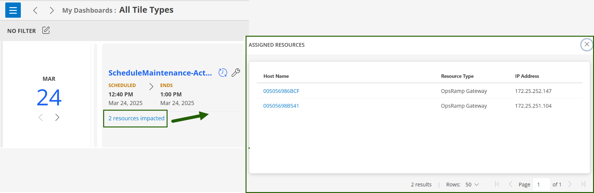 |
| Graphs visibility | The Alert Trend widget displays the number of Open Critical and Warning Alerts over time using a line graph. The graph helps track trends and identify any fluctuations in critical and warning alerts over a given period.  | The Alert Trend graph is now displayed as stacked bar graphs instead of a line graph. Stacked bar graphs provide better visibility of different alert severities (like critical, warning, OK) over time, making it easier to analyze trends and identify patterns.  |
| Resource availability visualization limitation | A tenant cannot view Device Availability for all of its clients in a single view. Instead, the tenant must select each client individually to view device availability.  | A tenant cannot view Device Availability for all of its clients in a single view. Instead, the tenant must select each client individually to view device availability.  |
| Filtering ability within tiles | Classic Dashboard widgets have the ability to search within a popup window. Example: Consider an Asset Inventory widget. When you click on a device count in the widget, it opens up a popup window, and you can search for Name, IP Address, OS, etc.  | Dashboard 2.0 does not support popup actions for any tiles except the Schedule tile. In the Schedule tile, clicking on any link opens a popup window, but there is no search option available within it. |
| Room mode activation | Classic Dashboards Room Mode can be activated at the individual dashboard level, allowing for more granular control over which specific dashboards have this mode enabled. | Dashboards 2.0, the Room Mode feature can only be enabled at the collection level, meaning it applies to all dashboards within that collection. Additionally, it does not require a password for activation. |
| Resource count mismatches | Resource counts were based on a legacy resource model with limited definitions and attributes. Resource counts plotted against availability and types followed a simpler categorization.  | Utilizes an enhanced resource model with broader coverage of resource definitions and attributes, leading to potential differences in resource counts when compared to Classic Dashboards. Due to the improved resource model, you may notice mismatches in resource counts when plotted against availability or resource types.  |
| Progress bar visualization | Uses an inbuilt progress bar visualization to display CPU utilization.
Provides a simple, percentage-based view. Easy to read at a glance but lacks detailed time-series insights.  | Does not support the inbuilt progress bar visualization, but uses a line graph to show CPU utilization trends over time. Provides a more detailed view, helpful for identifying patterns and anomalies.  |
| Alert tile displays alerts over a period with a default interval of 30 minutes. | The Alert Trend graph uses a 15-minute interval for displaying data over a period of time. | The Alert Trend graph previously used a 1-hour interval, even when displaying data for a 4-hour period. This interval has been reduced to 30 minutes. |
| How DB 2.0 works for Tenant and customer of the tenant | For Tenants:
For customers of Tenants:
| For Tenants:
For customers of Tenants:
|
Dashboard JSON Versioning and groupBy Behavior
Group By is supported in Resource, Alert, and Ticket tileSingle Value visualizations. To maintain backwards compatibility, the dashboard JSON version has been incremented to 2.
Behavior by Version:
- Version 1 (legacy):
- groupBy is ignored in Single Value visualizations.
- Version 2 (current):
- groupBy is honored and affects the rendering of Single Value visualizations.
Note
If any Single Value tiles are showing blank after the 07 patch, the Group By fields need to be removed and re-added.Group By Support for Single-Value Tiles
Before the 2025.07.U1 release, Group By was not supported for Resource, Alert, and Ticket Single-Value tiles. However, the Group By field may have been saved in the Single-Value tile configuration.
Starting from the 2025.07.U1 release, Group By support has been added for the Resource, Alert, and Ticket tile types.
Note
All dashboards created before the 2025.07-U1 release are set to Dashboard JSON Version 1.If the user updates any tiles, renames the dashboards, or moves a dashboard to a collection, the Dashboard JSON Version is automatically upgraded to Version 2. As a result, Single Value visualizations in that dashboard will start displaying the Group By field automatically.
To avoid multiple results, or if the tile shows “No Data Available” or appears blank, remove the Group By from the updated dashboard’s Single Value tiles.
JSON Version 1
Copying or exporting and then importing a JSON version 1 dashboard will introduce the Group By fields in the single value tiles of the newly created dashboard with JSON version 2.
JSON Version 2
Copying or exporting and importing a JSON version 2 dashboard will create an exact copy of dashboard without any changes.
Legacy Replacements
| Widget | EOL Replacement |
|---|---|
| Active console | Active console indication |
| Activity log | Integration/Application UI to display the failures |
| Antivirus stats | Moved to Reporting Apps |
| App integrations failures logs | Moved to Audit logs, navigate to Setup > Integrations > Audit Logs |
| Cloud Insights | To be available as Reporting app. |
| Patch Compliance | Available in Patch management 2.0 as Patch compliance Card |